|
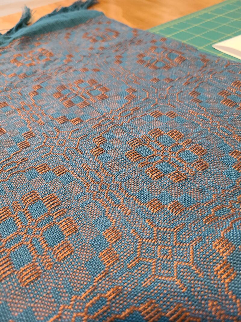
The title is a bit dramatic but it had to be said after this adventure of a project. Initially, I wanted to make an advancing twill with some burnt orange and turquoise perle cotton I had leftover from the rainbow bright project and a long ago project of some plain weave napkins. Well thanks to my favorite weaver, Sheila O'Hara, it turns out that when you have complimentary colored yarns blended together they will look grey from far away. I believe this is because of the subtractive color mixing but I still need to explore the concept further. Which Sheila sent me a pamphlet written by Robyn Glade-Wright titled 'Colour Mixing for Textiles' so maybe I'll learn something. Anyway, I really wanted to do orange and blue. And of course I started to see the colors everywhere! In fact right by my computer is a picture of the volcano goddess Pele which is orange and blue. And purusing Handwoven I found an article about complimentary colors. Then at the book store I was seeing orange and blue mixes. But in all of the examples I saw there was no true blending of the two colors. If the image had orange and blue they were very distinct from each other not mixed. Like in this picture of a hot springs at Yellowstone the blue is distinct from the surrounding orange.  Well needless to say my advancing twill that mixed orange and blue together wouldn't do for the next project so I started looking into something else. Since I'm reading about blocks and my painting from last week contained blocks I decided to start playing with blocks of Overshot. Since overshot is comprised of two solid blocks; pattern and background, and some halftone blocks. I decided to give it a try.  The colors are not distinctly different like in the Pele's volcano or the hot springs image but there is a clear dominance of orange on the front, and a dominance of blue/turquoise on the back.
Well the color play wasn't the only thing I got to learn on this piece. Lesson two was Overshot and sett. At least with the way I beat the weft I needed a more open sett to really push the background yarn into place. So after sampling I had to rethread the reed. Lesson three was how I tie the yarns to the back apron rod isn't foolproof. Found this out about three quarters of the way though the piece when half the warp went completely slack! When I tie the yarn onto to the back apron rod I just slide a metal rod through the yarns and then tie the metal rod onto the apron rod. Well, make sure you use high tensile yarn because if it breaks bad things happen. Like the giant run you see in the image above on the right. After washing and fiddling it's not crazy noticeable in the final piece but I'll forever know it's there. After all my crazy lessons on this piece I decided to finish the project it was intended for, a drawstring bag. I didn't really follow the directions but I did use this website to help me plan the bag: Sewingfromhome I also added a lining since I didn't want the handwoven fabric to stretch with usage. But with a lining there will be a side that is never seen. I chose the bright orange with all its floats to be on the inside. So here's my picture saying goodbye to this beautiful side.  Guess I should show off the lining since it is a crazy fun batik. My sewing skills are lacking a bit but hey this is about weaving not sewing! Ha!  Well I haven't officially added the drawstring yet but I'm finished sewing. And I finally found some lighting that hopefully shows off the shimmer of the fabric.  That's all for now, happy weaving!
0 Comments
Yesterday was the first Wednesday of the month which means a full day of awesome for me! First thing in the morning is the Redwood Fiber Arts Guild meeting and then volunteering in the costume shop for the local theater in the afternoon. It's creative talk all day long! For my adventures in weaving I've been reading about color and design. Which hopefully propels me into the next project. With the design book (Universal Patterns Vol 1) there was a sequence of understanding angles and congruent segments.  Practicing making congruent segments. Which eventually turned into a project of 5 inch squares cut into many sections. Once drawn the author states to color it, so, I chose primaries and practiced tinting. The act of adding white to a true hue.  Tinting of the Primary Hues. I'm thinking this project should lead into my next weaving project. Maybe something in Overshot, or Advancing Twill, or a Color & Weave pattern that mimics this block pattern with diamond progressions. But instead of tinting the original hues, for the weaving project I'll play with shading the original hue, aka adding black. That's all for today. I'll leave you with a fun image of the paint lithing into the water. 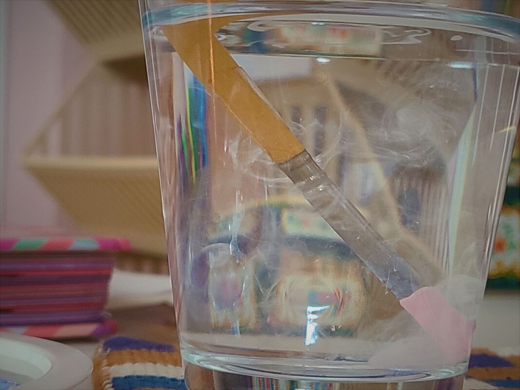 Paint slowly dispersing through the water after I dropped my paint brush in. |