|
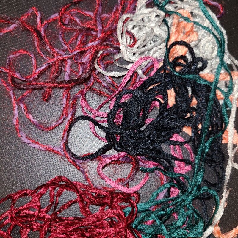
This week I started pondering my next project and it uses some really beautiful knitting yarns that I may or may not be cursing when I start weaving. The project is a cover up sweater and I just found some fun variegated purple and red knitting yarn at the most amazing store ever. The Legacy is a place in Sebastopol, CA that is a thrift store for craft items only. It is so fun to dig through and find exciting treasures, like this wool, mohair, cotton blend. Since I'm planning a sweater and this wool/mohair/cotton yarn has to be the weft I had to look for a thicker type knitting yarn for the warp. Well, last year I purchased some black cotton knitting yarn from Cast Away Yarns for a project and then decided not to use it so it's been sitting on the shelf staring at me since. Well why not try to use it as a warp!  Cotton yarn and variegated wool/mohair/cotton yarn Recently, I learned a trick about finding out if a knitting yarn will work as a warp yarn. First, you have to take a piece of yarn and hold each side. Then tug on it, go back and forth, relax then quickly pull taut. The trick comes in feeling the resistance in the yarn because yes, if you pull hard enough all yarns will break, but if you hear a crisp "thwap" when the yarn is pulled taut it should be strong enough for tensioning on the loom. The other, possibly more important, test is the abrasion test. Take the piece of yarn again holding it between your hands tightly and then rub it against the corner of something. Rub and rub and see what happens. This is supposed to mimic the yarn in the reed and heddles during weaving. If the yarn falls apart you know not to use it, or if it starts to fray maybe think about how annoyed you want to be, ha! Okay so I did both tests on the black yarn and it passed. Which means I shall try this knitting yarn as a warp, check back in a few weeks to see if these tests actually work. Now, after my last project of hating all the colors I tried I figured I better do a small test swatch to see if I like the two yarns together and, since I'm doing a pattern, if the pattern shows up. 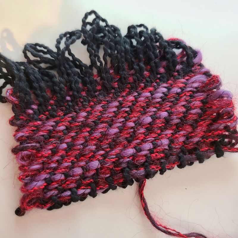 1/3 twill side Well, I grabbed my tiny pin loom and wove the pattern on it. The bottom part of the sample is the 1/3 twill and the top 5 or 6 picks is the 3/1 twill. And if you flip it over you can see the 3/1 twill pattern just as distinctly. 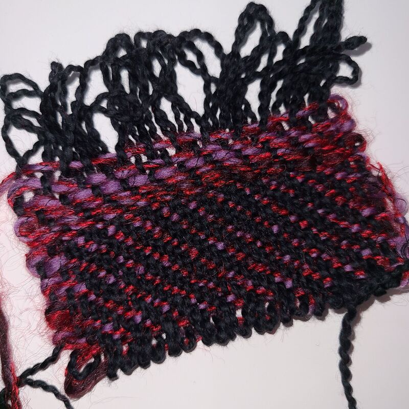 3/1 Twill Now I think I can start warping the loom without a headache during weaving (hopefully!).
The yarn is tested for weaving and the colors work together and with the pattern. So we'll see shortly if I have a beautiful sweater or a scary ball of fuzz. Wish me luck :) Happy Weaving!
0 Comments
Last week I thought I would weave up a simple scarf and have an easy project. Welp, the weaving is easy but the colors kept attacking me! My four categories were easy:
The part that made me insane was that I worked with chenille yarn. So the usual color and weave effects were drastically blurred and... well... nothing looked very elegant together. Since I wanted rich hues I warped up 7 yards of this beautiful deep red chenille and was ready to use a light gold chenille as the warp.  Immediately I hated the sett! So I rethreaded the red chenille in the reed, adding about an inch on both sides. And I didn't really like how the gold yarn took away from the beautiful red. That meant I started sampling.... Maybe purple would give a subtle design and keep the beautiful red.  Nope not a fan.... Maybe thicker chenille, or silver, or pink, or....  Nope! Well Christmas is around the corner maybe dark greens! Or beautiful white!  Nope! Okay fine what about sparkles! I won the Mystery Novel contest at our guild this summer which means I have new Rayon/Metallic yarn! Oh! wow and I dug so far into my stash I found silver Lurex, gold Lurex, and a crazy multi-colored metallic yarn.  Ha! I started with the multicolored metallic and decided it had to go with a white chenille so I unwove it all. And tried the silver Lurex  Meh.... At this point I had run out of sampling area so everything I tried had to be unwoven. This is also day 2 of me fussing with it. Which meant I was lost, nothing I tried really jumped out at me and now I was realizing two things. 1. This is why people wind yarns onto a card before warping 7 yards on to their loom! 2. Chenille and diamond patterns need more thought before warping 7 yards of material on their loom! Anyway, I was looking at all the yarns I had tried....
And I started thinking about how I liked the lighter yarns because they made the pattern prevalent, but I needed a warm yarn to compliment the red warp. And I did a face palm because lighter and warmer is GOLD...like the very first yarn I tried!!!!!!!!  Yep, it's not life changing-ly beautiful but it is a nice combination of colors and pattern. I finally finished one scarf in the diamond shape and then decided to mess with the pattern for the second scarf. Though I will only be changing it once!  Well this really simple project ended up taking 4 days! It was supposed to be an easy weave so that this week I could do something more intricate but I guess sometimes the easy road isn't really all that easy!
Until next time, happy weaving! This is more of a continuation of the Orange and Blue post. Basically, I learned that I wasn't entirely wrong thinking the orange + blue = grey has to do with subtractive mixing and lighting. But I wasn't entirely correct either. After reading Robyn Glade-Wright's pamphlet 'Colour Mixing for Textiles' I learned that there is a third type of mixing that is responsible for orange + blue = grey, Optical Mixing. Okay since I love light and its magical complexities we take for granted everyday I want to write out this beautiful phenomenon. Through countless experiments physicists have come to the belief that light is both a particle and a wave. Now bear with me.... The wave form of this awesome energy source can be split to produce different colors, think rainbows; sunlight through the prism of water. This is called additive mixing, and is useful for lighting displays. Adding wavelengths together creates a different wavelength and thus you can have lighting with red-orange, green, and blue-violet filters to produce a brilliant white light. Say for a spotlight on a dark stage. 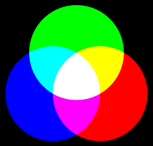 What about the particle form. Well particles can be absorbed or reflected and this wonderful property is demonstrated when physical colors are mixed. Take orange paint, this paint is made up of 'red' and yellow pigments. Therefore, the particles traveling at the wavelength of 'blue' will be absorbed. While the particles traveling at the 'red' and yellow wavelengths will be reflected. The amount of this reflection will give us the type of orange we see. (red is in quotes because it is said to be magenta when referring to pigments, and blue is said to be cyan) 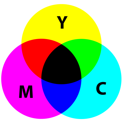 Okay now for the super fun trippy Optical mixing!! We only experience light through our eyes. Well this is an entirely different reference point and must be given its own category. This optical mixing seems to only exist in art and at those really fun optical illusion museums. Though I did find reference to it while watching The Great Courses lecture 'Secrets of Human Perception'. Anyway! Optical mixing happens because of how our eyes see light. There are rods and cones on the back of our eye that when stimulated send an electrical impulse to the occipital lobe of our brain to be interpreted. Rods activate in low lighting or for peripheral vision, while cones assist with seeing color. These cones are further classified into three groups; Red-orange, Green, and Blue-violet (you know the ones from the additive mixing section). The red-orange cones are only activated when there are red-orange wavelengths stimulating them and same with green and blue-violet. Now, obviously we do not see the world in these pure colors. There is always a mix of these happening in real life. To make it more complicated there are different proportions of each group of cones within our eye. There are more red-orange cones than green, and more green cones than blue-violet. Thus, our eyes can be easily stimulated by red-orange wavelengths but it takes more stimulation to occur to see blue-violet. 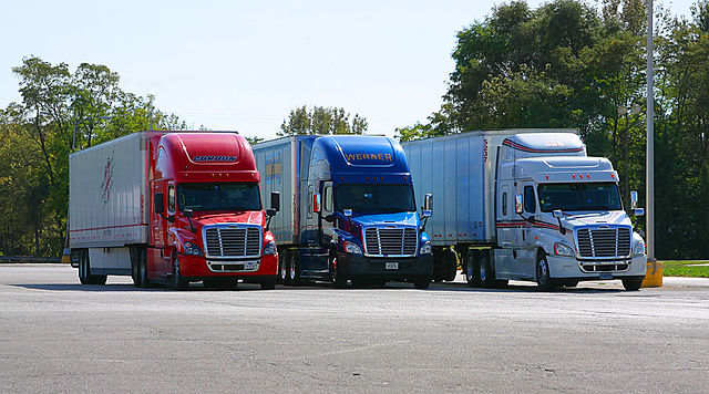 Why does the red truck seem brighter or larger? Okay so artists and optical illusion enthusiasts manipulate this color play in our eyes with pointillism or, if they are having fun, by hiding something in plane sight. Below is a painting by Paul Signac who is one of the developers of pointillism. 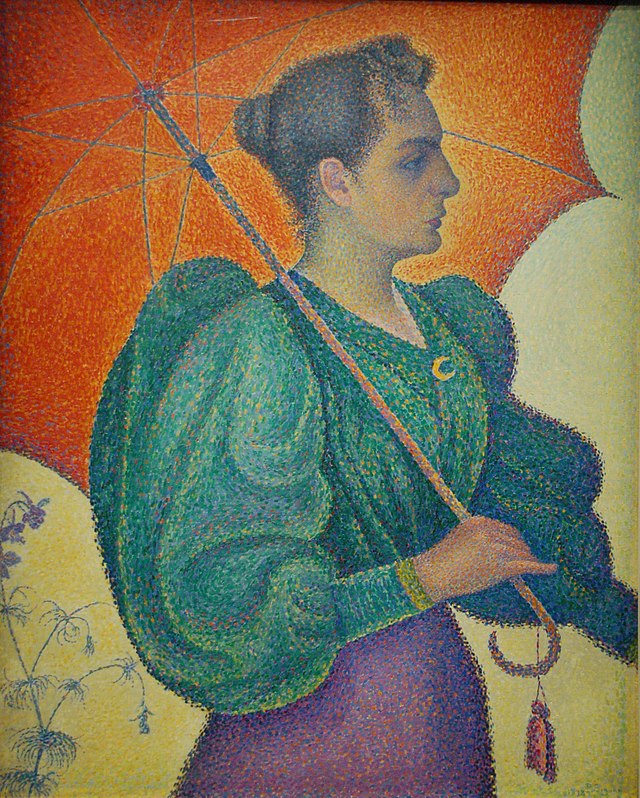 If you look closely her shirt isn't really green (or blue depending on your monitor, ha! yet another perspective of light) but instead is a combination of blue dots and yellow dots with bits of other colors for dimension of the sleeve. Viewed up close our eyes see the individual dots, but when viewed from far away our eyes blur the dots together, aka Optical mixing. 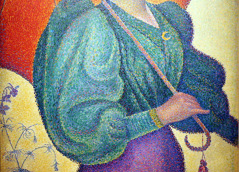 And because I love optical illusions I'll add this image where all the spheres are brown but because of optical mixing we see them as different colors from far away. 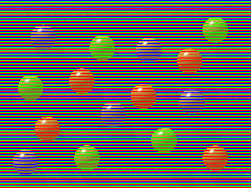 Click on this image to check out David Novick and more optical illusions. And finally, the reason why Sheila told me to be cautious of overly mixing orange and blue in a woven fabric. If orange and blue are woven in such a way that when seen from far away they blur to become a new color (optical mixing) you need to work with your yarns as though they are pigments that you are mixing (subtractive mixing). In subtractive mixing if you add orange and blue you are mixing complimentary colors. By mixing complimentary colors you are changing both pigments into and new color that will reflect (and absorb) all three primary colors. If you look at the color mixes in the first two images of this post you'll see that mixing three major groups always brings you to either white (wavelengths) or black (particles). Since our eyes are receiving this information we interpret the wavelength/particles as a grey.  Long story short mixing complementary colors thread by thread in your weaving will give you grey cloth when viewed from far away. Having motifs that stand out and define one complimentary color from another is wonderful! As you saw in the Orange and Blue post I wrote earlier this week. And that's it for my nerd alert post, ha! Happy weaving! The title is a bit dramatic but it had to be said after this adventure of a project. Initially, I wanted to make an advancing twill with some burnt orange and turquoise perle cotton I had leftover from the rainbow bright project and a long ago project of some plain weave napkins. Well thanks to my favorite weaver, Sheila O'Hara, it turns out that when you have complimentary colored yarns blended together they will look grey from far away. I believe this is because of the subtractive color mixing but I still need to explore the concept further. Which Sheila sent me a pamphlet written by Robyn Glade-Wright titled 'Colour Mixing for Textiles' so maybe I'll learn something. Anyway, I really wanted to do orange and blue. And of course I started to see the colors everywhere! In fact right by my computer is a picture of the volcano goddess Pele which is orange and blue. And purusing Handwoven I found an article about complimentary colors. Then at the book store I was seeing orange and blue mixes. But in all of the examples I saw there was no true blending of the two colors. If the image had orange and blue they were very distinct from each other not mixed. Like in this picture of a hot springs at Yellowstone the blue is distinct from the surrounding orange. 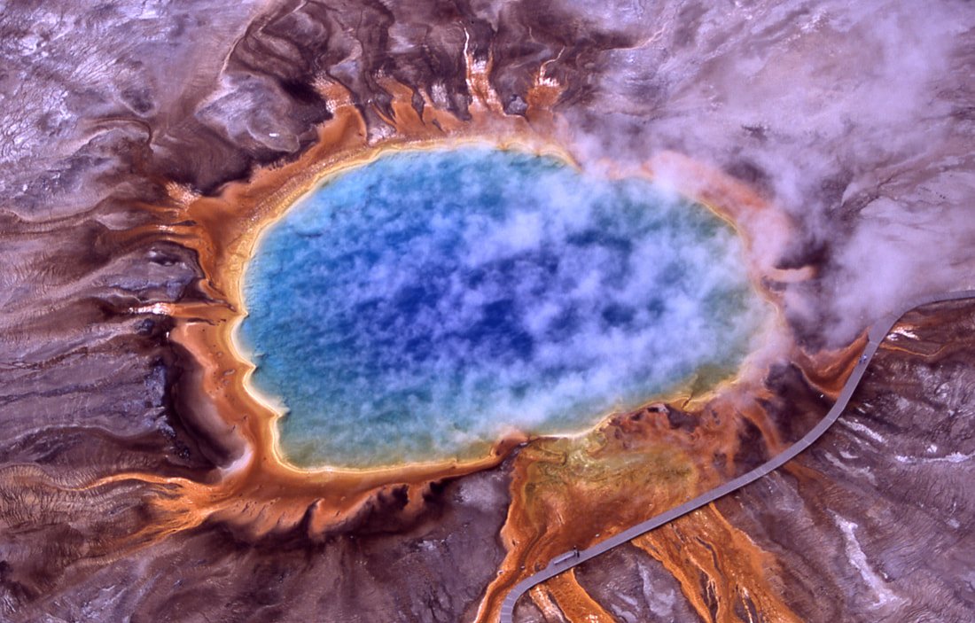 Well needless to say my advancing twill that mixed orange and blue together wouldn't do for the next project so I started looking into something else. Since I'm reading about blocks and my painting from last week contained blocks I decided to start playing with blocks of Overshot. Since overshot is comprised of two solid blocks; pattern and background, and some halftone blocks. I decided to give it a try.  The colors are not distinctly different like in the Pele's volcano or the hot springs image but there is a clear dominance of orange on the front, and a dominance of blue/turquoise on the back.
Well the color play wasn't the only thing I got to learn on this piece. Lesson two was Overshot and sett. At least with the way I beat the weft I needed a more open sett to really push the background yarn into place. So after sampling I had to rethread the reed. Lesson three was how I tie the yarns to the back apron rod isn't foolproof. Found this out about three quarters of the way though the piece when half the warp went completely slack! When I tie the yarn onto to the back apron rod I just slide a metal rod through the yarns and then tie the metal rod onto the apron rod. Well, make sure you use high tensile yarn because if it breaks bad things happen. Like the giant run you see in the image above on the right. After washing and fiddling it's not crazy noticeable in the final piece but I'll forever know it's there. After all my crazy lessons on this piece I decided to finish the project it was intended for, a drawstring bag. I didn't really follow the directions but I did use this website to help me plan the bag: Sewingfromhome I also added a lining since I didn't want the handwoven fabric to stretch with usage. But with a lining there will be a side that is never seen. I chose the bright orange with all its floats to be on the inside. So here's my picture saying goodbye to this beautiful side.  Guess I should show off the lining since it is a crazy fun batik. My sewing skills are lacking a bit but hey this is about weaving not sewing! Ha!  Well I haven't officially added the drawstring yet but I'm finished sewing. And I finally found some lighting that hopefully shows off the shimmer of the fabric.  That's all for now, happy weaving!
The warp from the Double Rainbow class with Jennifer Moore is finally off the loom! Only took 2 months to finished 3 yards, Ha! I took some pictures of both sides of the fabric for my notes. Eventually, I'll hang up the sampler for reference. Though I did cut off a portion of the pattern I came up with at the end of the warp. My kitchen needs potholders and some rainbow bright pot holders would be fabulous. The first part of the class we did simple squares to get familiar with the double weave process and to see what type of colors we would get on the colorful warp. Here's my sample.
After the simple blocks and Jennifer's block pattern she gave us in class I did some experimentation. First I tried double weave pick up and it looked terrible. If you go for matching the colors to get a single color pick up you end up with huge floats on both sides. And if you try pick up with with just a shape you can't see it because there are too many colors involved. You can see some of my failed attempts just above the Brook's bouquet in the next picture. After failing with pick up I tried Brooks bouquet. This looks a bit more interesting because you get a background and the colors pop! Not sure how I would use it in a project but it's in my sampler so maybe someday inspiration will hit.  The last portion I'll show off is the rainbow pattern I ended with, and wrote about a few weeks ago; 'If Rainbow Bright had a dog on the loom'.
And lastly, an extreme close up of the Brook's Bouquet for fun! 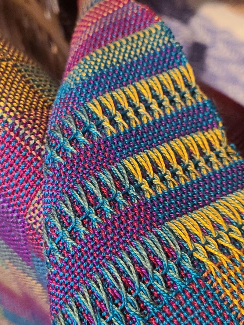 Happy Weaving!
|